How to Style Ceramic Objects on Shelves, Consoles, and Surfaces — A Practical Guide
Knowing how to style ceramic objects well is one of the most transferable skills in interior design. The principles that govern a shelf govern a console, a dining table, a windowsill, and a floor corner. They are not rules about ceramics specifically — they are rules about composition, negative space, and the relationship between objects and the surfaces they occupy.
What follows is a practical guide to those principles, illustrated with reference to the handmade ceramic art at Durao Studio.
The First Principle — Negative Space When You Style Ceramic Objects
The most consistent mistake when styling ceramic objects is filling too much of the available surface. Objects need space around them to be read as individual forms — without that space, even strong pieces become part of an undifferentiated mass.
In 2026, the designers leading the conversation on interior styling are unanimous on this point: negative space is not empty space. It is the frame that allows the composition to breathe. When styling ceramic objects on a shelf or console, the space left untouched is as compositionally active as the pieces placed on it.
A practical rule: after placing the ceramic objects, remove one. Then step back and look. In most cases, the composition is stronger with fewer pieces. The impulse to fill is almost always counterproductive.
Odd Numbers and Graduated Heights
When styling ceramic objects in groups, two principles work consistently across all surfaces and scales: odd numbers and graduated heights.
Odd numbers — three pieces, five pieces — read as intentional groupings. Two pieces read as a pair, which has its own symmetry and formality. Four pieces tend to resolve into two pairs. Three is the number that most naturally suggests a composition rather than a set.
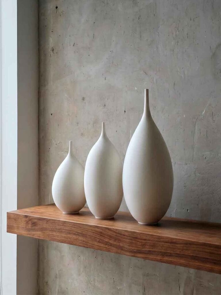
Graduated heights create visual movement within a group. Three ceramic vases of identical height read as a row. Three vases in graduated heights read as a composition — the eye travels from one to the next, reading the relationship between the forms rather than the forms themselves. The tallest piece anchors the group; the smallest creates the resolution.
This is why the Unikas collections at Durao Studio are offered in sets of three — the graduation is already built into the grouping. Each set is designed to work as a trio while each piece remains complete on its own.
How to Style Ceramic Objects on Different Surfaces
The surface a ceramic object is placed on changes how the piece reads and what the composition requires. Each surface type has its own logic.
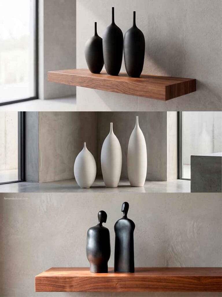
Floating shelf: The wall behind the shelf is part of the composition. A ceramic piece on a floating shelf reads against the wall — which means the wall color and texture matter. A matte black stoneware vase against a raw plaster wall is a different composition from the same vase against a painted white wall. Floating shelves work best with fewer, larger pieces rather than many small ones.
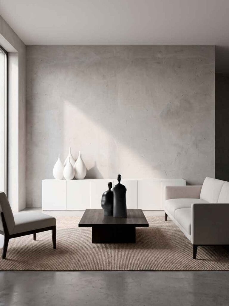
Console or sideboard: A longer, lower surface that invites a horizontal composition. Three ceramic objects in a loose grouping — not centered, not symmetrical — work well here. The horizontal line of the console anchors the objects; the objects introduce vertical movement. One object slightly forward of the others creates depth.
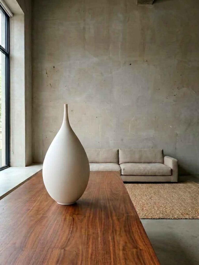
Dining table: Ceramic objects on a dining table must work at eye level when seated, not standing. This changes the scale requirements significantly. Taller pieces that read well from across the room can feel oppressive at a dining table. The Moradores sculptures — with their human scale and figurative presence — work particularly well at dining table height, where they create a dialogue with the people seated around them.
Coffee table: Lower, wider forms. The horizontal eye level of a coffee table composition is roughly from a seated position — which means the silhouette of the piece matters more than its height. A wide-bodied stoneware vase reads as grounded on a coffee table. Tall, narrow forms can feel unstable at this scale.
Floor: Large format ceramic pieces placed on the floor, in a corner or against a wall, are one of the most underused placements in residential interiors. A single tall vase or a pair of Moradores sculptures on the floor removes the scale limitation of any shelf or table and allows the piece to be read architecturally — as an element of the room’s composition, not an accessory within it.

Material Contrast — What to Place Beside Ceramic Objects
When styling ceramic objects alongside other materials, contrast is more effective than coordination. A matte black stoneware vase beside warm walnut reads better than the same vase beside dark wood of a similar tone — because the contrast between the mineral surface and the organic grain is what creates the visual interest.
A few material pairings that work consistently with the Durao Studio collections:
Black stoneware and warm wood: The Unikas Black pieces read particularly well on walnut, oak, and other warm-grained woods. The contrast between the mineral black surface and the warmth of the wood grain creates a composition that doesn’t require anything else.
White stoneware and marble or stone: The Unikas Quartz pieces — with their mineral, stone-like surface — read naturally on marble consoles and stone surfaces. The material conversation between the ceramic and the stone is coherent: both are mineral, both are dense, and the difference in color creates the necessary contrast.
Sculptures and linen or textile: The Moradores sculptures work well in contexts where a soft textile — a linen throw, a wool cushion — is visible nearby. The contrast between the density of the fired stoneware and the softness of the textile creates a sensory tension that makes both more present.
What doesn’t work: placing ceramic objects of similar tone and finish on surfaces of the same tone and finish. The lack of contrast collapses the composition — the objects disappear into the surface rather than reading against it.
Browse the pieces available to style at Durao Studio — Unikas Black, Unikas Quartz, and Moradores. Each piece ships to the United States with a signed certificate of authenticity.
For more on the sculptural approach to decorating with ceramics, read How to Decorate with Ceramic Vases — The Sculptural Approach and Abstract Ceramic Sculpture for the Home.
To inquire about a specific piece, contact Fernando directly.
Follow the studio: @durao.studio
For further context on composition principles in interior design, see Interior design on Wikipedia.